
If you’ve ever admired silky gradients in illustration or flawless transitions in coloring books, chances are you were looking at alcohol marker blending done right. Alcohol-based markers are loved by artists for one reason above all: they blend beautifully when you understand how to control them.
Unlike water-based markers, alcohol markers dry quickly, layer transparently, and allow colors to merge directly on the paper. But they can also streak, bleed, or create harsh edges if used incorrectly. This guide will walk you through how blending actually works, common mistakes to avoid, and practical techniques you can apply immediately.
What Makes Alcohol Markers Blend So Well?
Alcohol markers contain dye-based ink suspended in alcohol. When applied to paper, the alcohol evaporates quickly—but not instantly. That short window of “wet time” is exactly where blending happens.
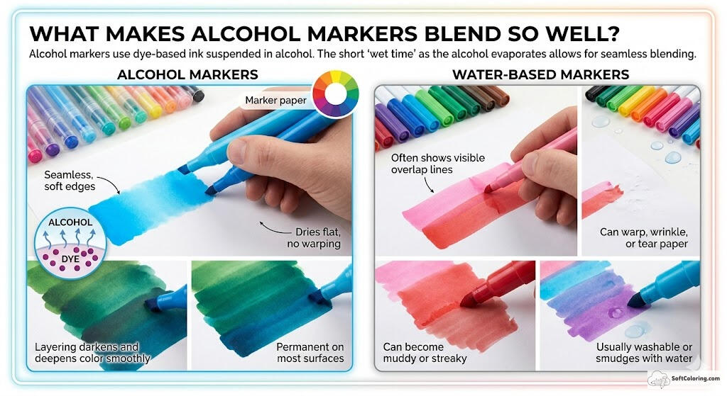
Because the ink is transparent, colors can be layered gradually without becoming opaque too fast. When two wet shades meet, they naturally merge and soften at the edges. This allows you to create smooth gradients without using water or brushes.
To better understand why alcohol markers perform differently, here’s a quick comparison:
| Feature | Alcohol Markers | Water-Based Markers |
| Blending | Seamless, soft edges | Often shows visible overlap lines |
| Paper Impact | Dries flat, no warping | Can warp, wrinkle, or tear paper |
| Layering | Darkens and deepens color smoothly | Can become muddy or streaky |
| Permanence | Permanent on most surfaces | Usually washable or smudges with water |
The Foundation: Choosing the Right Paper
Blending success starts before you even uncap your marker.
Thin paper absorbs ink too quickly and causes feathering. Standard printer paper can lead to streaking and uneven saturation. For the best results, use marker paper or smooth, bleed-resistant paper designed for alcohol ink.
A good paper allows the ink to sit slightly on the surface before absorbing, giving you more blending time and smoother transitions.
Core Alcohol Marker Blending Techniques
There isn’t just one blending method. Skilled artists switch techniques depending on the effect they want.
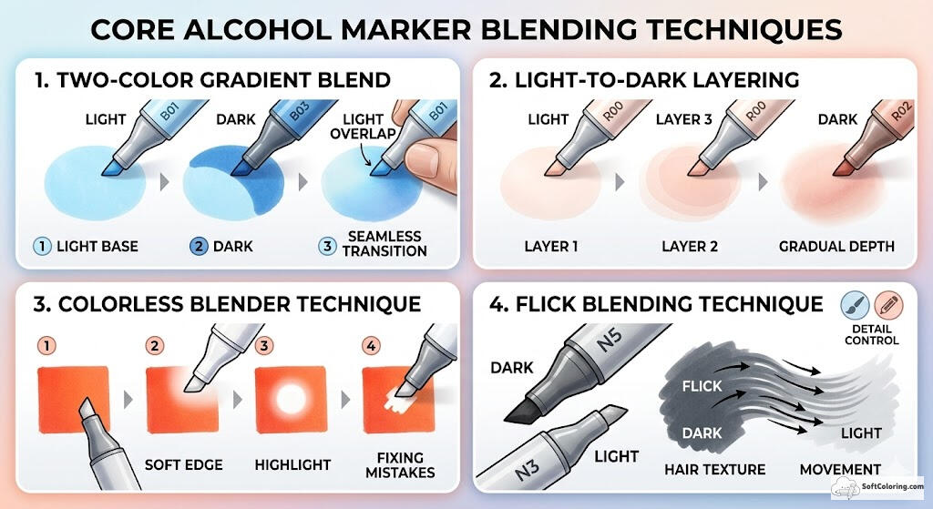
1. The Two-Color Gradient Blend
This is the classic method most people aim for.
Start with your lighter color and lay down an even base. While it’s still wet, apply the darker shade where you want depth or shadow. Immediately go back in with the lighter marker and overlap the edge where the two colors meet.
The lighter color acts like a softener, pushing and smoothing the darker pigment. Work in small sections so the ink doesn’t dry before you blend.
The key is speed and layering—not pressing harder.
2. The Light-to-Dark Layering Method
Instead of blending while wet, this technique builds depth gradually.
Apply multiple layers of the lighter tone first. Then slowly introduce the darker shade in thin passes. By repeating light strokes rather than heavy pressure, you create a natural gradient that looks smooth without obvious blend lines.
This method gives you more control and works especially well for skin tones and soft shading.
3. The Colorless Blender Technique
A colorless blender doesn’t actually “blend” in the way many assume. It contains clear alcohol that moves pigment rather than mixing colors.
You can use it to:
- Soften harsh edges
- Create highlights
- Fade color outward
- Fix small mistakes
Instead of merging two colors, it redistributes existing ink. Think of it as shaping color rather than combining it.
4. The Flick Blending Technique
For textured surfaces like hair, fur, or fabric, try flick strokes.
Start in the darker area and flick outward toward the lighter region. Then use the lighter marker to flick back toward the darker section. The overlapping strokes create a natural-looking transition while maintaining texture.
This technique adds movement and depth without losing detail.
How to Choose Colors for Better Blends
Smooth blending starts with smart selection. Even the best technique can’t fix a poor color match. Use these four simple rules to choose markers that naturally work together:
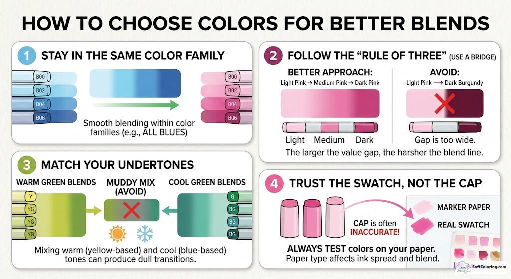
1. Stay in the Same Color Family
Markers within the same family (such as all Blues or all Pinks) share similar base pigments, so they blend more smoothly. A light blue will transition into a dark blue far better than into a purple.
2. Follow the “Rule of Three” (Use a Bridge)
Avoid jumping from a very light shade directly to a very dark one. The larger the value gap, the harsher the blend line.
- Better approach: Light Pink → Medium Pink → Dark Pink.
- Avoid: Light Pink → Dark Burgundy (This creates harsh, unblendable lines)
Skipping the mid-tone often creates visible, difficult-to-soften edges.
3. Match Your Undertones
Keep warm tones with warm tones and cool tones with cool tones. Mixing a yellow-based green with a blue-based green can produce dull, muddy transitions. Matching color temperature keeps blends vibrant and clean.
4. Trust the Swatch, Not the Cap
Marker caps are often inaccurate. Always test your chosen colors on the same paper you’re using. Paper type affects how ink spreads and blends, so a quick swatch can prevent surprises.
Common Blending Mistakes And How to Fix Them
Even experienced artists run into blending issues. The difference is knowing whether the problem is timing, motion, or ink control. Here are technique-focused mistakes that often go unnoticed.
1. Working Against the Drying Time
The Mistake: Trying to fix a blend after the ink has already dried completely.
The Fix: Alcohol markers blend best during partial evaporation—not fully wet, not fully dry. If an area has dried, re-activate it lightly with the lighter marker before attempting to smooth transitions.
2. Bleeding the Edge Line
The Mistake: Coloring right up to the outline too quickly, causing ink to push past the border.
The Fix: Leave a tiny margin near the edge at first. Blend your main area, then carefully return to define the outline once saturation is under control.
3. Uneven Ink Distribution
The Mistake: Stopping mid-stroke and lifting the nib repeatedly, which creates darker “start-stop” marks.
The Fix: Use continuous, confident strokes. Overlap each pass slightly to maintain even coverage and avoid visible streak bands.
4. Ignoring Ink Flow Differences Between Markers
The Mistake: Assuming all markers release ink at the same rate. In reality, some are juicier than others.
The Fix: Test flow on scrap paper before blending. If one marker lays down heavier ink, apply it more lightly to maintain balance.
5. Forcing a Blend That Needs a Transition Shade
The Mistake: Trying to push two distant tones together repeatedly.
The Fix: If after 2–3 passes the line remains harsh, stop. That’s a value gap issue. Introduce a middle tone instead of overworking the paper.
Practice Exercises to Improve Your Blending
Blending isn’t just mechanical, it’s intuitive. The more you practice seeing how colors interact, the more natural your transitions will feel. These exercises are designed to improve your Alcohol Marker Blending skill.
The “Gradient Playground”
This section is about flow. Don’t obsess over perfection—focus on how colors visually move into one another.
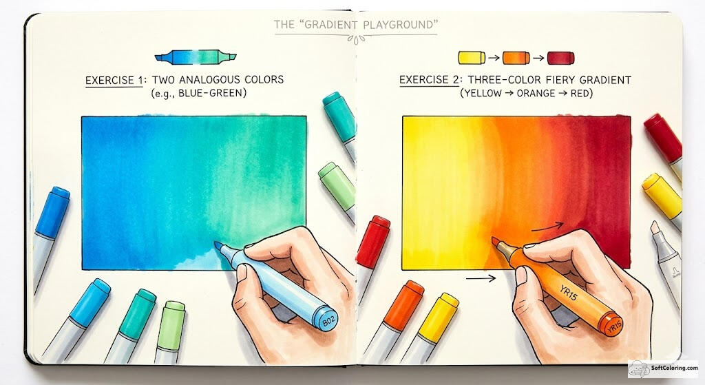
Exercise 1: Blend Two Analogous Colors
Choose two colors that sit next to each other on the color wheel, such as blue and blue-green or pink and red. Create a small rectangular swatch and blend them into each other.
Don’t focus on technique — just observe how the colors visually move into each other. Aim for a seamless transition with no visible edge.
Exercise 2: Create a Three-Color Fiery Gradient
Pick three warm colors (like yellow, orange, and red). Start with yellow as your base, introduce orange in the middle, and deepen the outer edge with red. Focus on layering gradually and maintaining a wet edge between transitions.
The “Texture Talk”
Blending isn’t only for smooth gradients. It can also create texture and dimension.
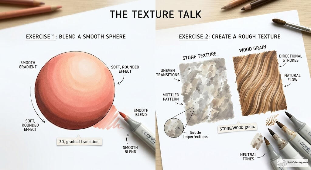
Exercise 1: Blend a Smooth Sphere
Draw a small circle and imagine a light source from one direction. Use a light base tone, then gradually build shadow on one side with a darker shade. Blend carefully to create a soft, rounded effect.
If done correctly, the circle should appear three-dimensional, not flat. The transition between highlight and shadow should feel gradual and controlled.
Exercise 2: Create a Rough Texture (Stone or Wood Grain)
Blend two or three neutral tones, but allow slight variation in pressure and stroke direction.
- For stone, keep transitions uneven and mottled.
- For wood grain, use directional strokes that follow a natural flow pattern.
The goal is to learn when not to over-blend. Texture often lives in subtle imperfections.
Advanced Tips for Professional Results
Once you’ve mastered the basics, small technical adjustments can dramatically improve the quality of your blends. These advanced tips focus on control, consistency, and efficiency.
- Working in small sections to maintain wet edges.
- Keeping your strokes consistent in direction to avoid visible streak patterns.
- Using circular motions for smoother coverage in large areas.
- Layering lightly instead of pressing hard for richer depth.
- Most importantly, stay relaxed. Tension in your hand often translates into uneven strokes.
Don’t be afraid of small imperfections — they are part of developing control and understanding how ink behaves on paper. With time, your transitions will look smoother, your textures more intentional, and your color choices more confident. Keep practicing, stay relaxed, and continue refining your technique to truly elevate your Alcohol Marker Blending.

